
A landing page has one job: turn visitors into leads, signups, or customers. That sounds simple, but building high-converting landing pages takes more than a nice design. It requires clarity, focus, and a strong understanding of what motivates people to act.
Whether you are promoting a product, collecting email addresses, or running paid ads, your landing page should remove friction and guide visitors toward a single goal. In this guide, we will cover the fundamentals that make landing pages work.
What Makes a Landing Page Convert?
A high-converting landing page gives visitors exactly what they expect, without distractions. It answers three questions fast:
- What is this offer?
- Why should I care?
- What should I do next?
If a page is vague, cluttered, or slow to load, people leave. If it is clear, persuasive, and easy to use, conversions go up.
The best landing pages are built around one offer and one action. That focus is what separates a landing page from a regular website page.
For a useful reference on improving page usability and performance, see web.dev’s guidance on web performance and UX.
Start With a Strong Value Proposition
Your value proposition is the core message on the page. It should explain the benefit of your offer in a way that is easy to understand.
A strong value proposition is:
- Clear
- Specific
- Benefit-driven
- Relevant to the audience
Avoid clever wording that confuses readers. Instead, say what you offer and why it matters. Visitors should understand the value within a few seconds.
Example
Instead of saying:
“A smarter solution for modern teams”
Say:
“Save 10 hours a week with automated client reporting”
The second version is specific and outcome-focused. That is the kind of message that supports high-converting landing pages.
Keep the Design Simple and Focused
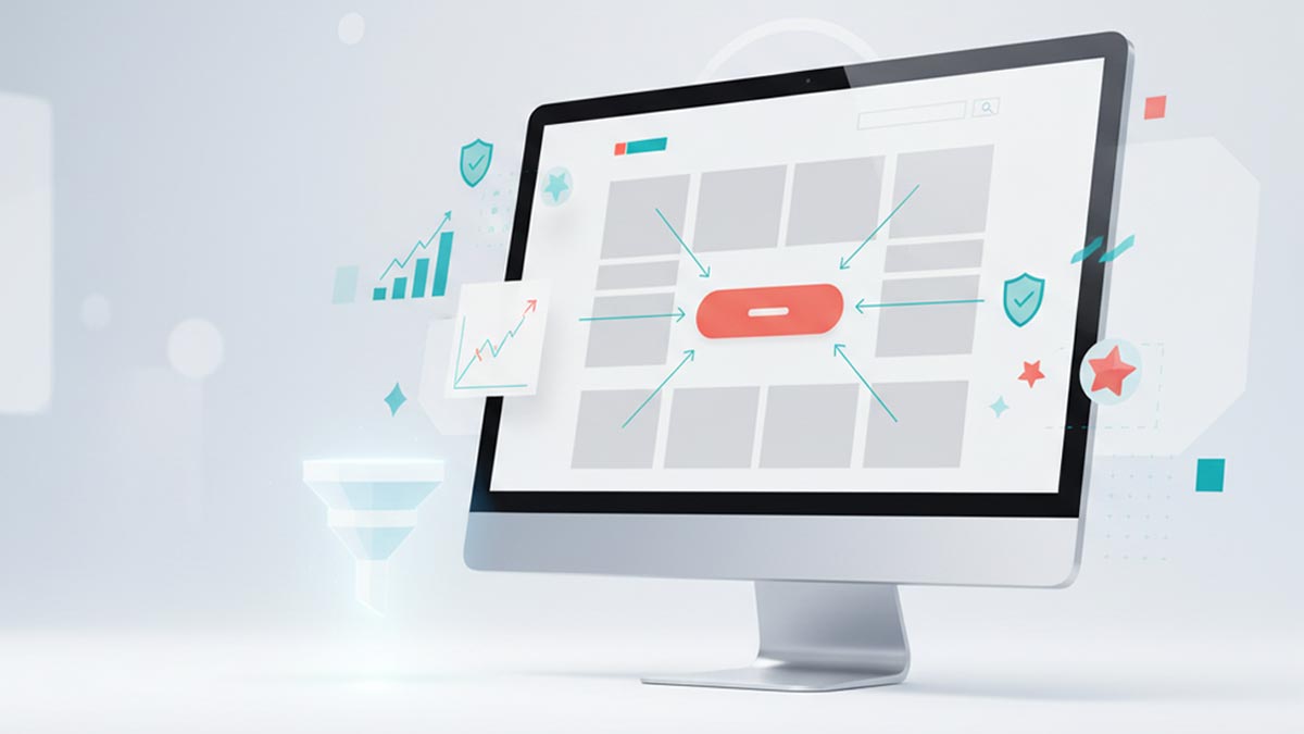
Good landing page design should support the message, not compete with it. The layout should guide the eye toward the call to action.
A simple design usually works best because it reduces distractions and keeps attention on the offer. That means:
- No unnecessary navigation links
- Minimal competing buttons
- Plenty of white space
- Clear visual hierarchy
- Readable fonts and contrast
Your page does not need to be flashy. It needs to be easy to scan and easy to trust.
Use Visual Flow Intentionally
Place the most important information near the top. Then lead the visitor down the page with supporting benefits, proof, and a clear CTA. Each section should answer the next question a visitor might have.
Write Copy That Focuses on Benefits
People do not buy features alone. They buy the results those features create. That is why landing page copy should focus on benefits, not just product specs.
For example:
- Feature: “24/7 monitoring”
- Benefit: “Protect your business even while you sleep”
To improve conversions, use language that connects the offer to the visitor’s goals, pain points, and desired outcome.
Helpful Copy Tips
- Use short sentences
- Break up text with headings and bullets
- Speak directly to the reader
- Focus on one main message
- Remove jargon whenever possible
When copy is easy to read, it is easier to act on.
Make the Call to Action Impossible to Miss
Your call to action is where the conversion happens. It should stand out visually and be written clearly.
A strong CTA:
- Uses action-oriented language
- Matches the visitor’s intent
- Appears multiple times on longer pages
- Feels easy to understand
Instead of generic buttons like “Submit,” try more specific CTAs such as:
- Get My Free Quote
- Start My Trial
- Download the Guide
- Book a Demo
The best CTA is obvious, relevant, and low-friction. It should feel like the next natural step.
Add Trust Signals
Even great offers can stall if visitors do not trust you. Trust signals help reduce doubt and make people feel more confident about converting.
Common trust signals include:
- Testimonials
- Client logos
- Reviews
- Security badges
- Case studies
- Money-back guarantees
- Statistics or proof points
Use real proof whenever possible. Specific testimonials and measurable results are often more persuasive than generic praise.
Optimize for Speed and Mobile
A landing page that loads slowly loses visitors before they even see the offer. Speed matters, especially for traffic from ads and mobile devices.
To improve performance:
- Compress images
- Remove unnecessary scripts
- Keep the page lightweight
- Test loading speed regularly
Mobile optimization is just as important. Your page should look clean and function well on smaller screens. Buttons should be easy to tap, text should be readable, and forms should be short.
Use Forms Wisely
If your landing page includes a form, keep it short. Every extra field can reduce conversions.
Only ask for what you truly need. For many pages, name and email are enough. For sales leads, a few more fields may be necessary, but the rule still applies: keep friction low.
Good forms are:
- Short
- Easy to complete
- Clearly labeled
- Placed near the CTA
The easier it is to convert, the better your results.
Test and Improve Over Time
No landing page is perfect on the first try. The most effective pages are improved through testing.
You can test:
- Headlines
- CTA button text
- Form length
- Page layout
- Hero images
- Social proof placement
Small changes can create big improvements in conversion rate. Use data to guide decisions instead of guessing.
Final Thoughts
High-converting landing pages are built on clarity, focus, and trust. They communicate one offer, one benefit, and one action without unnecessary distractions. When you combine strong messaging, simple design, persuasive proof, and smart optimization, you create a page that works harder for your business.
If you are building the rest of your website, you can also connect your landing page strategy to your broader online presence with our Service page.
The goal is not to impress visitors with complexity. The goal is to make it easy for them to say yes.